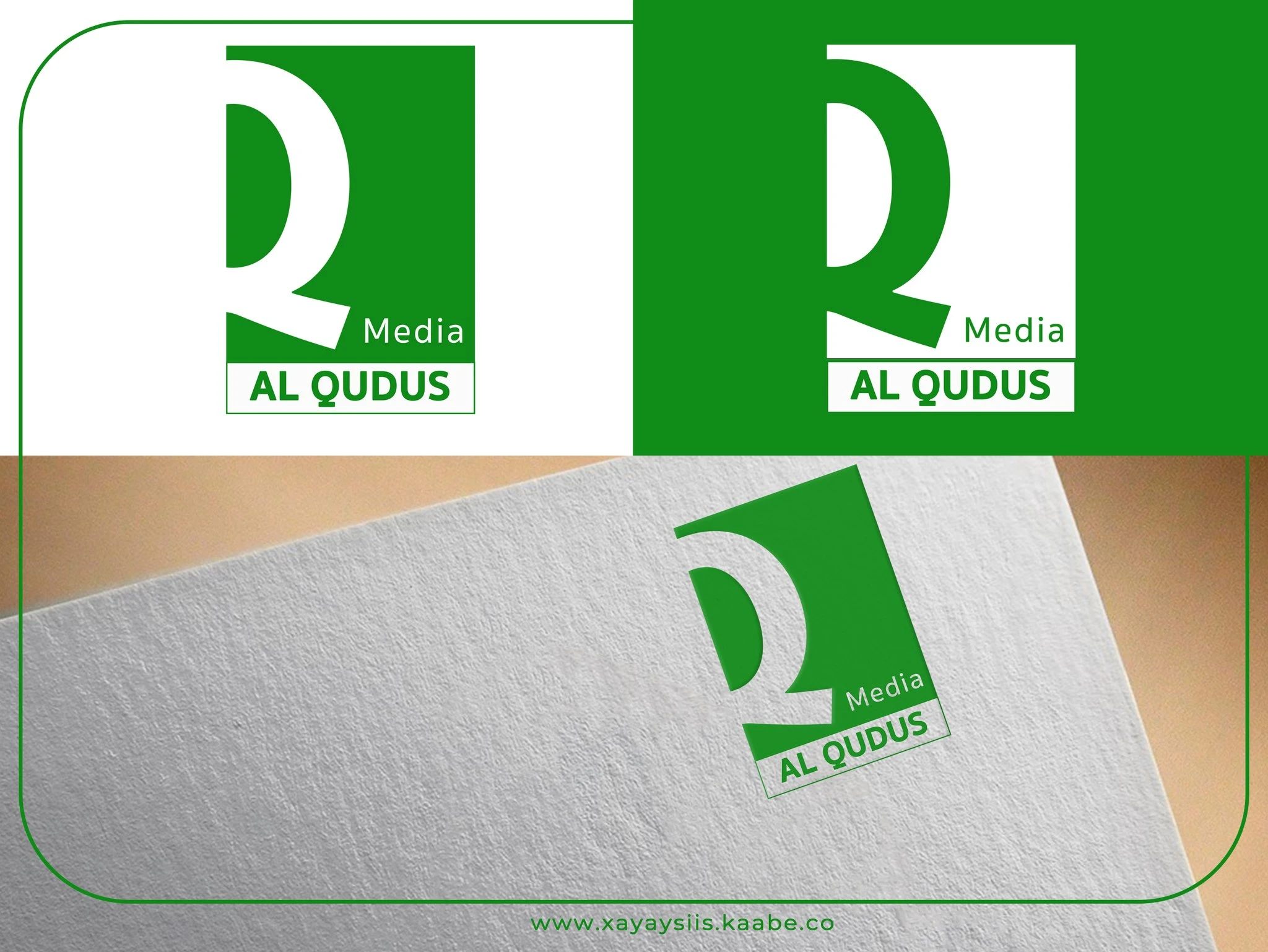
Kaabe Solution created a clean and minimal brand identity for Al Qudus Media, focusing on simplicity, recognition, and versatility.
The logo is built around a bold “Q” letterform, forming the core visual identity and representing the brand name “Qudus.” The design emphasizes clarity and scalability, ensuring strong visibility across both digital and print applications.
A green and white color palette was selected to reflect:
- Growth and trust
- Media credibility
- Fresh and modern communication
The layout maintains a compact and structured composition, making it suitable for social media, broadcasting, and branding materials.
Project Scope
• Logo concept development
• Typography and layout design
• Brand color selection
• Identity refinement for multi-use
The final outcome is a simple, recognizable logo that can be easily adapted across various media platforms.